Beautiful Booth Awards 2026
Scoring Rubrik:
- Design Aesthetic (10 points)
Visual Appeal: How visually captivating is the booth? Consider the use of color, lighting, and space.Cohesiveness: How well do the design elements work together to create a unified look? - Attendee Engagement (10 points)
Interactivity: Does the booth effectively engage visitors? Consider interactive elements like demos, games, or technology. - Messaging (10 points)
Message Clarity: How clearly does the booth articulate its main message? Is it understandable, or does it rely too heavily on buzzwords? Would buyers be confused?Relevance and Focus: How relevant is the messaging to the company's goals and the target audience? Does it maintain a consistent focus, or does it distract or confuse?
2026 Applications
RSAC 2024 Winners
The inaugural 2024 Beautiful Booth Awards, which we eagerly anticipated despite a few unforeseen delays, turned out to be an extraordinary display of talent and creativity at the RSAC Conference expo hall! Judging the submissions was especially tough—nearly every booth impressed us, with scores that ranged from a solid 18.5 to a perfect 30 out of 30!
From low-budget setups that maximized creativity, to whimsical wonderlands built with extreme attention to detail and bold budgets, to straightforward designs from storied brands that emphasized a strong leadership message, each booth was a testament to the ingenuity of cybersecurity marketing, product, sales, and leadership teams around the globe.
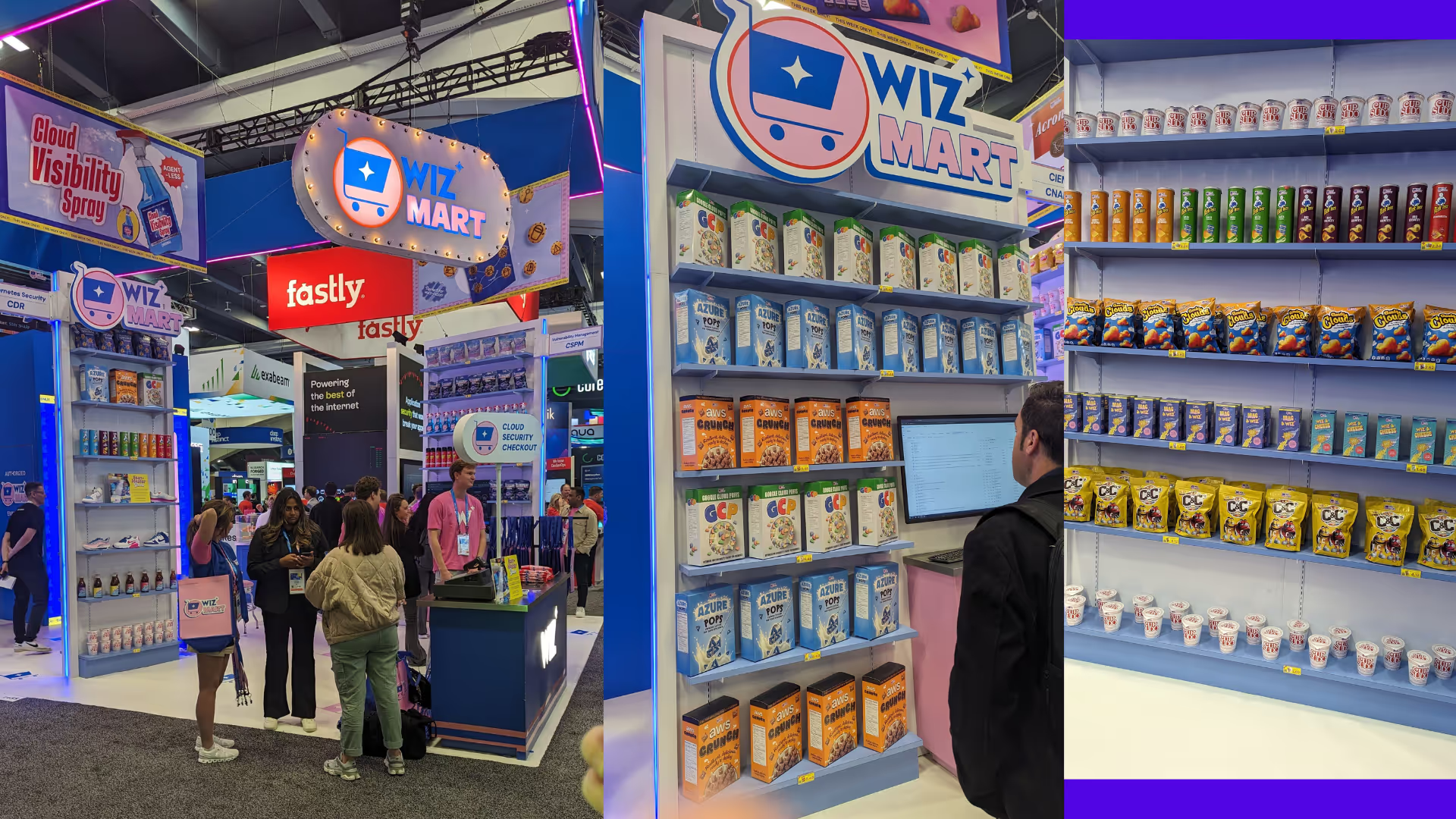
We saw a delightful array of themes that captivated our imaginations and demonstrated the versatility of the cybersecurity industry’s approach to inciting curiosity, brand messaging, and capturing attention: Mend.io and Pentera turned heads with their charming candy themes, while Wiz and JupiterOne drew bustling crowds with their inventive supermarket setups. Meanwhile, Gutsy and Dazz took us on a nostalgic trip with their fun, retro-inspired booths.
As we dive into the details of the winners, let’s celebrate not just the booths themselves but the spirited field, product marketing, content, and social media teams behind them.
Here are the winners for each category:
Beautiful Booth Award Winners: Small Booths
10×10 Booth Winners
Third Place: DataDome
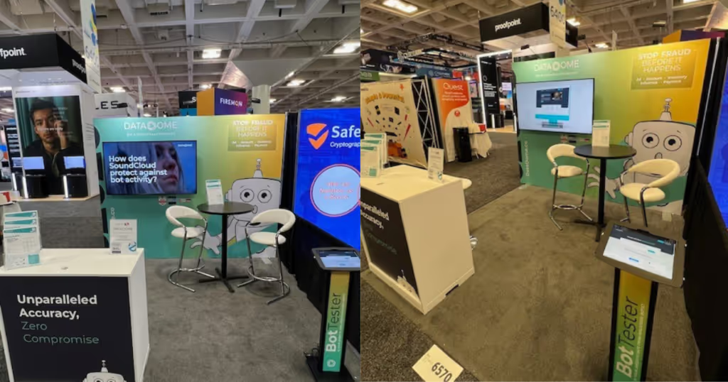
DataDome showcased a seamlessly integrated design that combined aesthetic appeal with functional space utilization, creating a welcoming environment for attendees. Their booth excelled in delivering their core message with clarity, ensuring that each visitor left with a solid understanding of DataDome’s offerings. The thoughtful integration of colors, lighting, and interactive elements made their booth not only a visual treat but a cornerstone for meaningful engagement.
Second Place: Gutsy
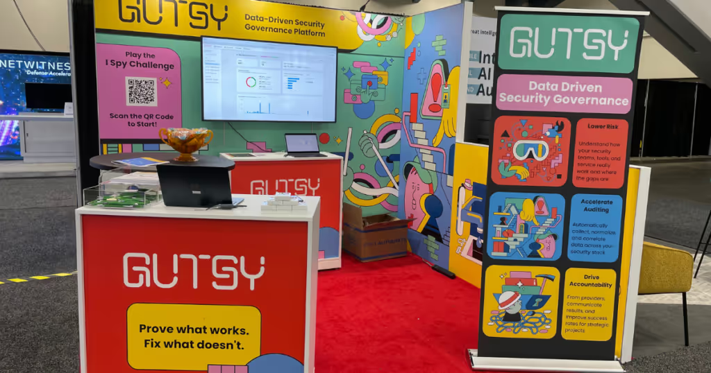
Gutsy‘s booth was a kaleidoscope of colors, featuring a lively assortment of characters and icons that reimagined traditional cybersecurity themes with a whimsical twist. Their interactive “I Spy” game, built into the booth design with a QR code, not only drew visitors in but also kept them engaged with a playful challenge that highlighted their security solutions in a fun and approachable manner. The booth’s design was not just visually appealing but also strategically effective in fostering interactive learning experiences.
First Place: LimaCharlie
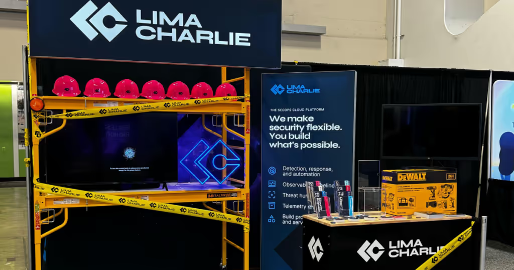
LimaCharlie truly set a standard with their booth’s vivid use of industrial themes and vibrant colors to emphasize the robustness of their buildable SecOps Cloud Platform. Incorporating elements like construction visuals and interactive demos, their space effectively communicated the platform’s capabilities, allowing security professionals to visualize building and customizing their infrastructure as easily as one would in a construction setting. Their strategic use of bold colors and engaging activities captured the attention of passersby, making it a memorable pit stop.
10×20 Booth Winners
3rd Place: Beyond Identity
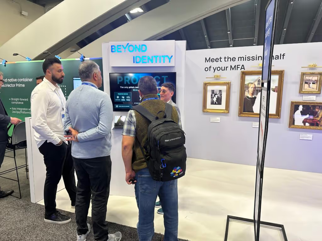
Beyond Identity crafted a booth theme around “Meet the missing half of your MFA,” using engaging visuals (half of picture frames missing! That’s an eye draw!) and interactive elements to depict their security-first authentication and access solutions. The booth was designed to simulate the importance of comprehensive security measures, using the analogy of famous incomplete art pieces to illustrate missing components in typical MFA setups. Their interactive displays encouraged attendees to engage deeply with the technology, offering demonstrations on how their passwordless solution enhances security beyond common MFA methods. This setup not only attracted significant attention but also effectively communicated the need for robust, zero-trust security frameworks, encouraging visitors to rethink their current security measures.
2nd Place: Savvy Security
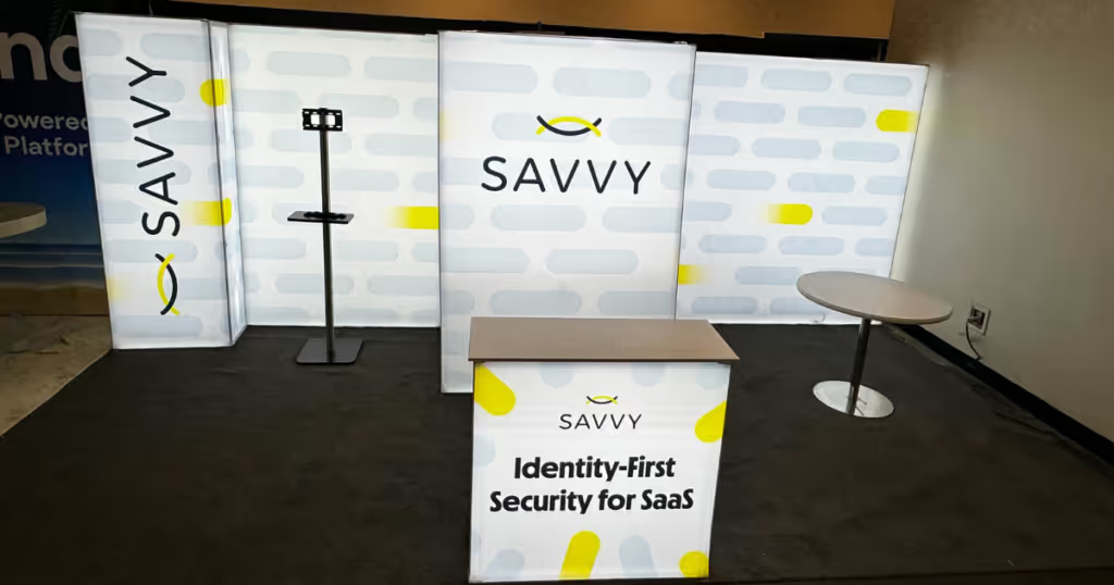
Savvy Security‘s creative use of limited resources made it stand out to us…along with the lighting! Savvy’s booth stood out with a clean, backlit design that made the space glow, attracting visitors even from afar. This design choice was especially effective in maximizing their limited space and ensuring visibility. To engage visitors, they employed scented devices to enhance the atmosphere and provided branded flashlights to illuminate the concept of “Shining a light on Shadow IT.” The booth featured an information kiosk, demo station, and private meeting spaces, efficiently using every inch of the area. Their straightforward messaging, emphasized by the booth’s simple yet bold design, clearly communicated their focus on Identity-First Security for SaaS, effectively linking their branding with their technological solutions.
First Place: GitGuardian
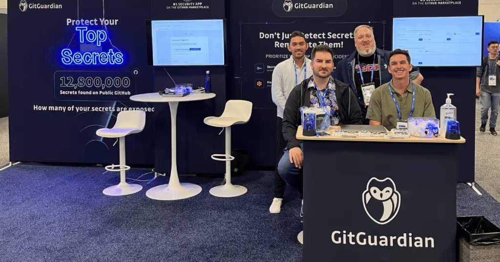
GitGuardian‘s booth design utilized a simple yet effective approach with a custom neon sign and blue rotating siren lights that attracted attention in a less-trafficked corner of the exhibit hall. The neon lighting provided a bright contrast against their brand blue, effectively drawing eyes and highlighting their offerings. The booth’s design was cohesive, extending the neon theme into their giveaways like branded notepads with invisible ink pens. Engagement was high due to the dynamic visual elements and a comfortable demo area, which invited attendees to learn more interactively. Their messaging was clear and directly communicated the purpose of their secrets detection technology, resonating well with visitors who understood the specific challenges in managing secret sprawls within IT environments.
Beautiful Booth Award Winners: Medium Booths
Long (10×30 & 10×40) Booth Winners
Third Place: Intel 471
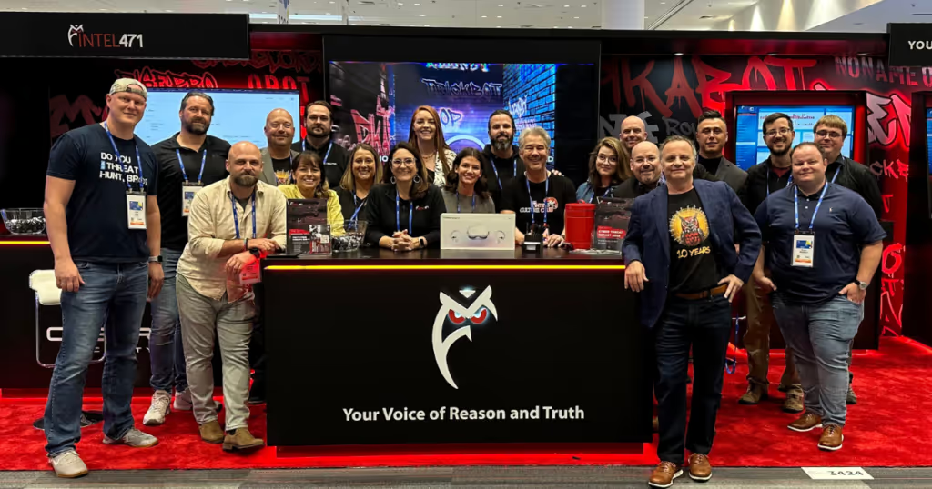
Stepping into Intel 471’s booth meant entering a vivid representation of the cyber underground. With its bold black and red color scheme and graffiti-style visuals, the booth offered an immersive experience that was both visually striking and deeply informative about the digital threats lurking beneath the surface.
Second Place: Halcyon
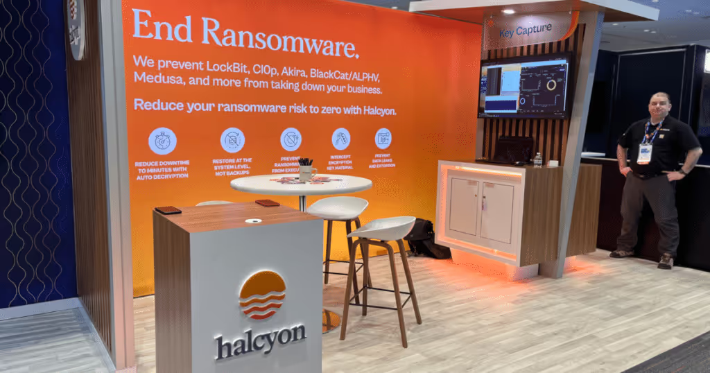
Halcyon‘s booth design was a masterpiece of simplicity and elegance, utilizing a warm color palette and clean lines to create a soothing atmosphere amid the hustle and bustle of the conference. Their use of high-quality, natural materials and thoughtful spatial arrangements spoke volumes about their brand’s focus on tranquility and reliability in cybersecurity solutions.
First Place: Forward Networks
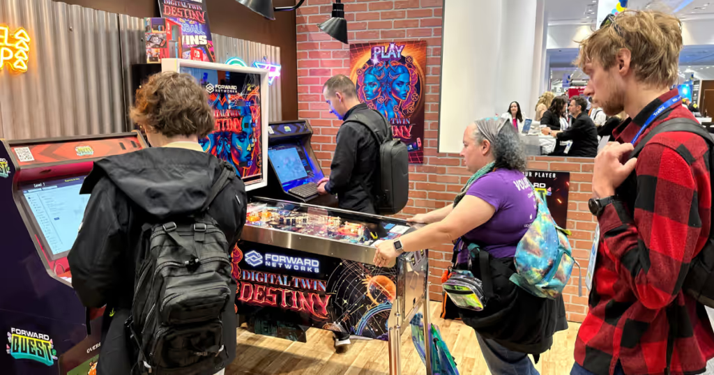
The Forward Networks booth transported visitors back in time with its arcade bar theme, blending nostalgia with the latest in network verification technology. From pinball machines to a gamified software demonstration, the booth was a hub of activity that stood out for its inventive approach to engagement. This creative environment facilitated discussions on cybersecurity in the most entertaining manner, ensuring that the experience was as informative as it was memorable.
20×20 Booth Winners
3rd Place tie: Mend.io and Dazz
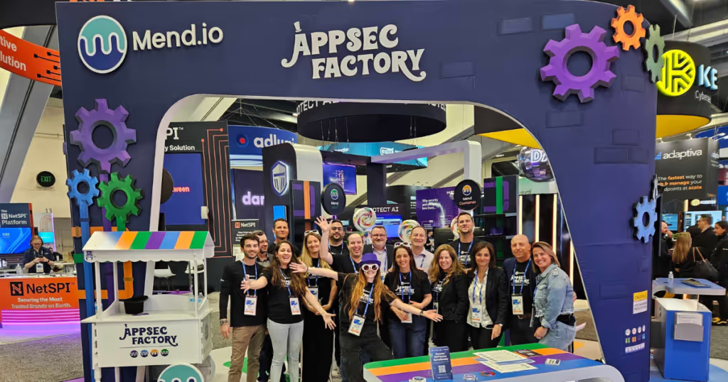
Third Place (Tie): Mend.io Mend.io transformed their booth into an interactive ‘AppSec Factory,’ cleverly themed around Willy Wonka’s Chocolate Factory. This playful and imaginative setting not only captured the essence of their brand colors but also seamlessly integrated their application security products into the design. The booth featured colorful, candy-themed decorations that made complex security solutions appear fun and engaging. Visitors were drawn in by the chance to find a “Golden Ticket” among real chocolate bars, which added an exciting, gamified element to their experience. The overall design was highly engaging, effectively utilizing the space to create an environment that was both educational and entertaining. Their messaging cleverly tied back to their security platforms, making serious tech discussions delightful and memorable.
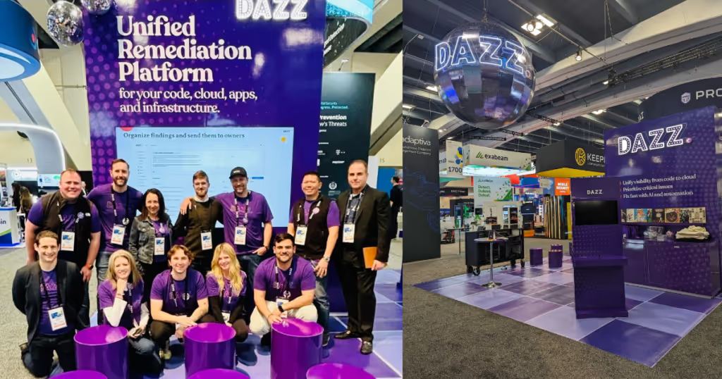
Third Place (Tie): Dazz Dazz embraced a disco-era theme that transformed their booth into a vibrant dance floor from the past. With a professional DJ spinning classic hits, the atmosphere was energetic and inviting. The booth’s design featured a vintage record wall and colorful disco flooring, creating a dynamic visual appeal that stood out in the conference hall. Attendee engagement was high, with interactive presentations and dual-sided demo stations that allowed for immersive product demonstrations. The clear and consistent messaging throughout the booth effectively communicated Dazz’s solutions for risk prioritization, remediation time reduction, and securing CI/CD pipelines. Their innovative approach not only drew attention but also facilitated meaningful discussions about cybersecurity in a uniquely engaging environment.
Second Place: Devo
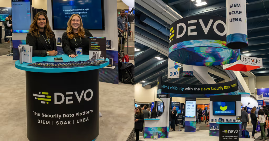
Pictures by Devo
Devo’s minimalist design maximized the impact of their messaging by focusing on simplicity and clarity. Their open, welcoming space facilitated interactions, with strategic video content emphasizing product testimonials for social proof, a giveaway of their latest CISO resource, “The Modern CISO: An Essential Guide for CISO Success,” and live demos that communicated their Security Data Platform’s benefits. Highlighting their commitment to the cybersecurity community, Devo replaced traditional swag with donations to the nonprofit organization Cybermindz for each booth interaction, and provided professional headshots for 358 security pros!
First Place: JupiterOne
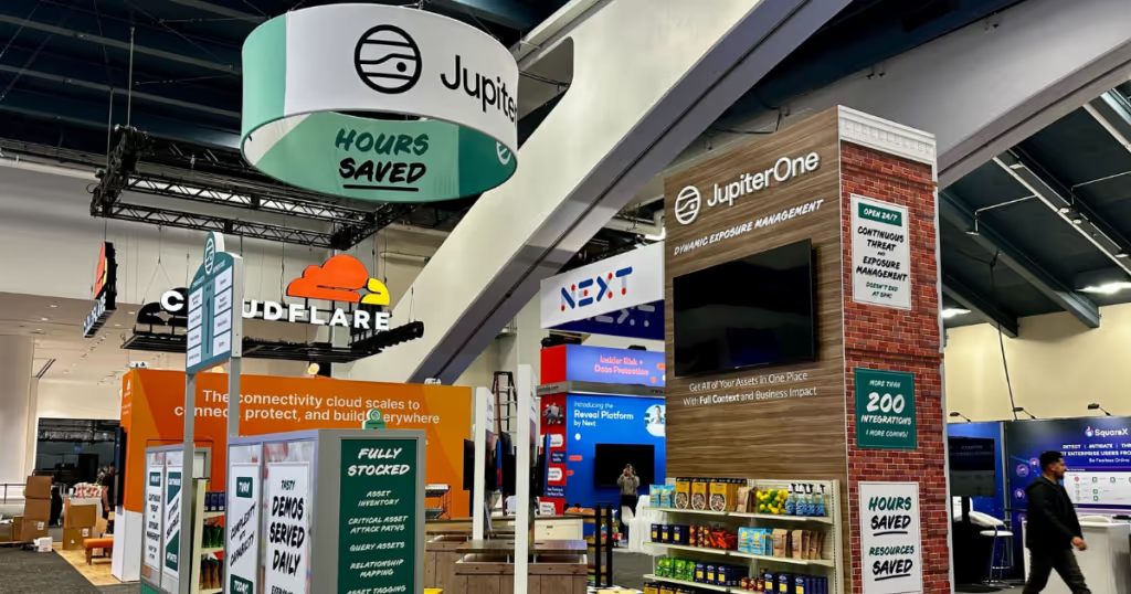
JupiterOne‘s booth at the RSAC Conference stood out with its creative supermarket theme, inspired by Meow Wolf’s Omega Mart. This innovative approach transformed the booth into a neighborhood grocery store, complete with aisles, product bins, and signage cleverly tailored to showcase JupiterOne’s cyber asset management capabilities. The design was not only visually engaging but also made the complex subject of cyber asset attack surface management relatable and understandable through a familiar shopping experience. Interactive elements allowed visitors to explore products (cyber asset types) hands-on, enhancing the learning experience. This effective use of theme and interactivity, coupled with clear and direct messaging, ensured that the booth was not only a visitor favorite but also a memorable highlight of the conference, demonstrating JupiterOne’s commitment to innovation and user-friendly technology solutions.
Beautiful Booth Award Winners: Large Booths
Big spaces and big budgets impose their own challenges.
20×30 Booth Winners
3rd Place: Pentera
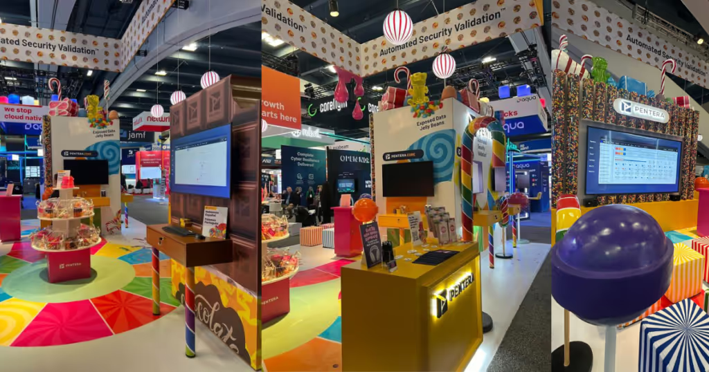
Pentera‘s booth at the RSAC Conference brilliantly captured the imagination with its vibrant “Candy Store” theme, turning the complex process of security validation into an enchanting and playful adventure. Their booth design drew heavily on colorful, confectionery-inspired visuals to illustrate the journey of achieving comprehensive security validation, making it both visually captivating and highly engaging. Interactive elements, such as guessing the number of gumballs in a machine or finding a golden ticket after a demo, gamified the learning process, ensuring that visitors not only received information but also enjoyed the experience. Educational materials cleverly styled as menus detailed the “flavors” of security tests Pentera offers, simplifying complex concepts into digestible parts. This creative and engaging approach effectively communicated Pentera’s capabilities in a fun and memorable way, leaving a lasting impression on attendees.
Second Place: Abnormal Security
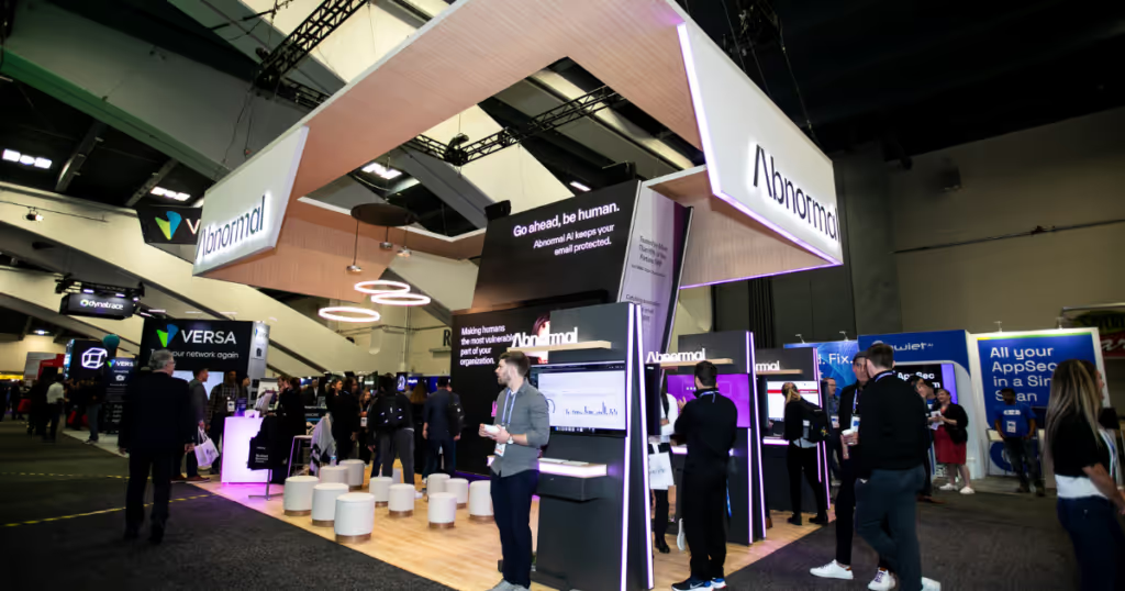
Abnormal Security‘s booth at the RSAC Conference was designed to feel more like a retail space than a traditional B2B cybersecurity setup. The booth used a minimalist design with natural materials and a neutral color scheme to create a relaxed environment for attendees. Interactive elements, such as the “Whack-a-Nomaly” game and “Anomaly Expedition” challenges, effectively educated visitors on cyber threats while encouraging engagement. The clear messaging, focused on their core promise “Go ahead, be human,” highlighted the capabilities of Abnormal AI in protecting emails from cyber threats, offering visitors both understanding and reassurance in a memorable setting.
1st Place: Wiz

Picture by Cybersecurity Marketing Society
Wiz‘s booth at the RSAC Conference, themed as “Wiz Mart,” cleverly transformed their exhibit space into a one-stop shop for cloud security, mirroring the layout and experience of a classic supermarket. This unique approach not only visually captivated attendees but also made the complex topic of cloud security highly approachable. The booth featured custom-made merchandise that cleverly related cloud security themes to everyday supermarket products, enhancing the thematic consistency. Interactive elements, such as a QR code scanning game, invited attendees to discover hidden content on the shelves, greatly increasing engagement and participation. Regularly scheduled demos, including a raffle for custom-made Nike shoes, kept the booth bustling with activity. The messaging throughout the booth was clear and playful, effectively communicating the importance and functionality of Wiz’s cloud security solutions in a fun and interactive manner.
30×30 and Larger Booth Winners
3rd Place: Splunk
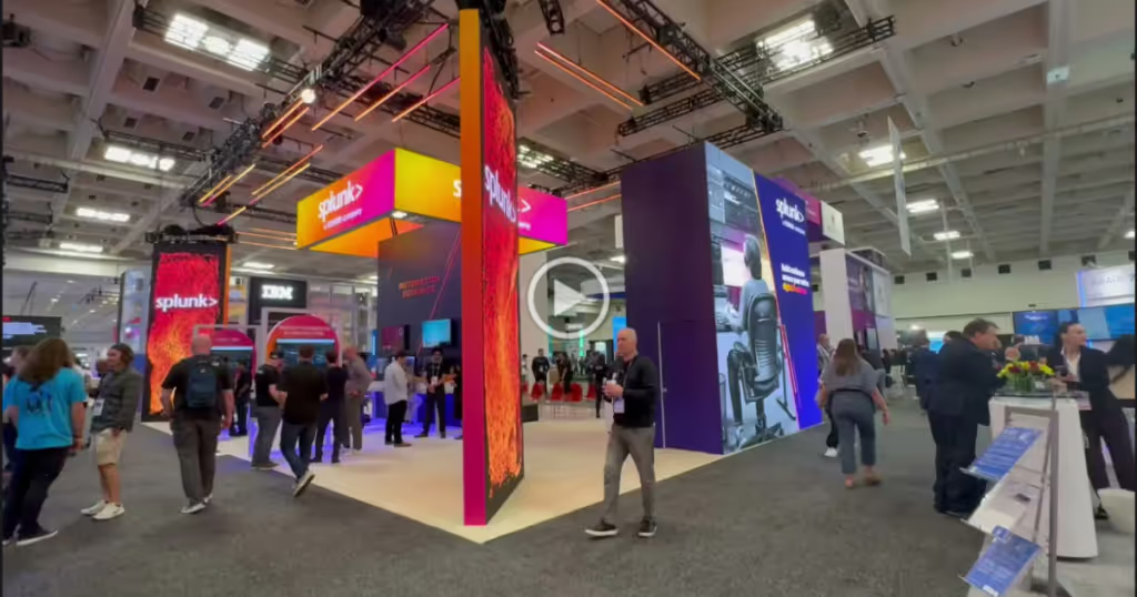
Splunk‘s booth at the RSAC Conference was designed to embody the concept of “SOC of the Future,” integrating state-of-the-art technology to pull visitors into an immersive exploration of security operations. The booth featured dynamic LED pylons at each corner, which not only displayed engaging visuals but also served as beacons broadcasting key messaging about Splunk’s core capabilities and innovations. These pylons rotated messages and displayed vivid photography, encapsulating the essence of their customer-focused solutions. The booth’s open design facilitated easy access and interaction, with activities like Automation Games and Theater Sessions, where Splunk showcased their latest products and partnerships. These elements combined to not only draw attendees into the booth but also keep them engaged with hands-on demonstrations and informative presentations, effectively communicating Splunk’s vision for future security operations centers.
2nd Place: CommVault
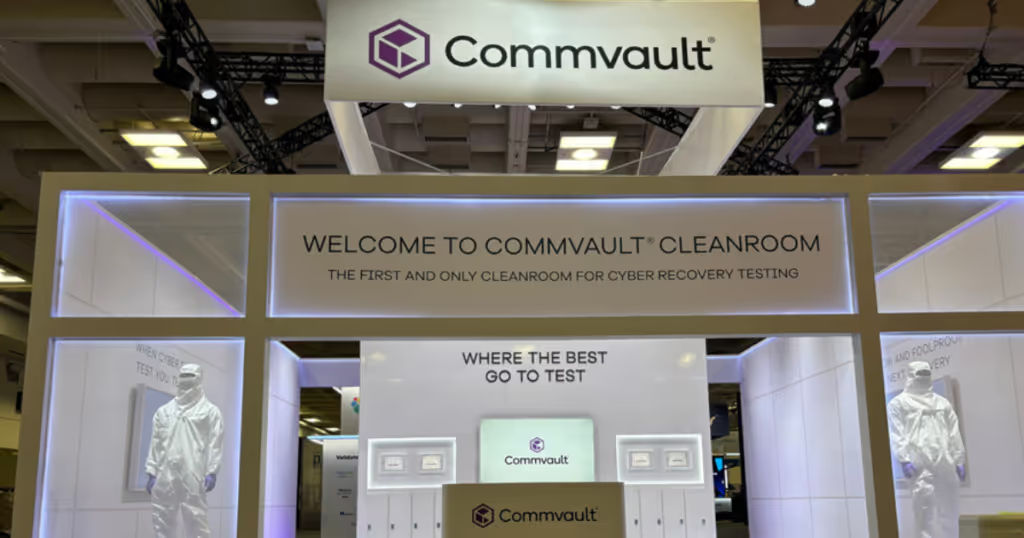
CommVault‘s booth at the RSAC Conference stood out with its bold, all-white design, intentionally crafted to represent the pristine environment of a cleanroom, aligning with their Cloud Cleanroom Recovery campaign. This striking visual theme was not only eye-catching but also symbolically reinforced the company’s focus on providing secure and reliable data recovery environments. The booth featured mannequins dressed in bunny suits and staff in coordinated attire, enhancing the thematic authenticity and visual impact. Interactive elements, like polarized sunglasses that revealed hidden content on privacy monitors, offered a unique, engaging experience for visitors. CommVault’s messaging was clear and impactful, emphasizing the critical importance of testing cyber recovery plans regularly. The integration of design, interactivity, and messaging effectively communicated the essence of CommVault’s capabilities, ensuring attendees left with a deep understanding of the company’s value in enhancing cybersecurity resilience.
1st Place: Varonis
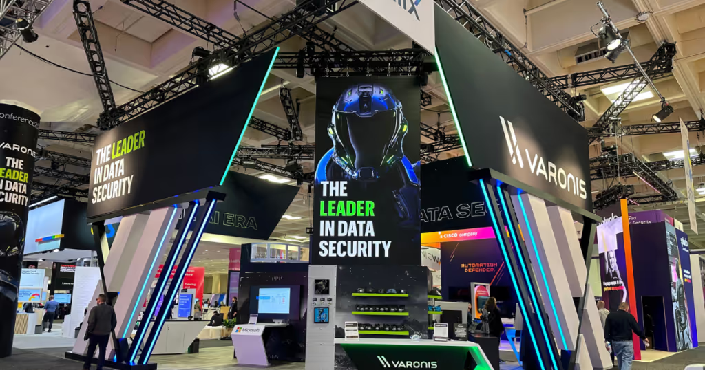
Varonis‘ booth at the RSAC Conference stood out with its striking black and white color scheme, designed to draw attention to vibrant brand elements and create a visually engaging space. The booth layout was inviting, with multiple interactive stations where attendees could engage with the Varonis platform through detailed demonstrations showcasing its real-time data security and threat detection capabilities. The booth featured a unique interactive component—a custom hat bar where attendees could design personalized hats using various patches and styles, enhancing their engagement and providing a memorable takeaway. Additionally, Varonis introduced a gamification element with Varonis-branded coins. Attendees earned these coins by participating in demos and interactions, which they could then use to redeem exclusive swag at the hat bar. This approach not only increased booth traffic but also deepened visitor engagement. Varonis also held regular presentations that were concise and informative, often leading to deeper discussions about data security challenges and solutions. These presentations effectively communicated Varonis’ expertise and leadership in the field, ensuring that their message resonated well with the audience.
Notable Entrants!
While the winners of the Beautiful Booth Awards exemplify the pinnacle of creativity, innovation, and engagement, there are several entrants whose remarkable displays also deserve special recognition. Although these participants did not secure a top spot, their booths stood out in a fiercely competitive field, demonstrating exceptional design, interactive experiences, and impactful messaging. Each of these entrants showcased unique strategies that significantly enhanced their visibility and interaction with attendees, proving that even without a win, their presentations were noteworthy and effective. Here, we highlight these notable booths that, in a less competitive category, might have taken home a prize for their compelling and creative approaches to booth design and audience engagement at the RSAC Conference.
- BugCrowd BugCrowd centered their booth around their brand mascot, “Buggy,” which created a unique and engaging focal point that drew attendees for photo opportunities. The booth featured a custom 60” touchscreen offering an interactive demo, enhancing the visitor experience on the floor. BugCrowd’s messaging was direct and jargon-free, emphasizing “Unleash human creativity for proactive security,” which resonated clearly with the audience. Despite not having extravagant giveaways, their presence was memorable due to the vibrant and energetic hosting by a theatre emcee in a bright orange blazer, which added a personal and lively touch to their presentation.
- Sweet Security As newcomers at RSAC, Sweet Security used their brand’s bold lime colors and backlit LED lights to illuminate their booth, making it visible even from the far end of the conference. Their design matched their brand’s lively aesthetic, and they enhanced engagement by distributing Sweet lemonade in reusable cups branded with their logo. This approach not only served as effective swag but also maximized brand visibility across the conference venue. Their messaging tied their product’s capabilities to the freshness of lemonade, emphasizing a new approach to securing native cloud environments.
- Securonix Securonix’s large booth was designed to introduce their revamped brand and new AI-Reinforced Capabilities under the Securonix EON brand. The booth was vibrant and informative, serving as a hub for interaction among customers, prospects, and partners. Their messaging focused on AI-Reinforced Platform, Frictionless Experience, and Cybersecurity Mesh, which was clear and succinct. Engagement was high with activities like a punching bag game where participants could “knock out” AI-powered attacks. The booth’s new sophisticated purple color palette and continuous activities like large-screen demonstrations and interactive demos kept the booth bustling with visitors.
- SonicWall SonicWall’s booth emphasized their commitment to their partner community and pursuit of relentless security, highlighted by their new tagline “Never Alone. Relentless security.” Their design was inviting, with a clear white background and pops of their brand orange. Engagement activities included a lock-picking exercise with prizes, which kept the booth interactive and conversational. Their presence was unified, from booth design to staff attire, including SonicWall branded Nikes, enhancing cohesion and visibility throughout the conference.
- ReversingLabs ReversingLabs’ booth stood out with its “Particles and Packages” graphical treatment, symbolizing the transition from physical to digital threats. The design was inviting, with a lighter background and cohesive elements like LED screens and demo stations enhancing the visual appeal. They engaged attendees with “Meet the Author” book signings and discussions, providing insights into cybersecurity challenges. The booth’s messaging was effective, emphasizing ReversingLabs as a trusted authority in file and application security, with clear and engaging visuals to support their comprehensive cybersecurity solutions.
- Tines Tines created a booth that was permeable and approachable, removing any barriers to engagement. Their design used bright brand colors and natural materials, reflecting their unique and abstract illustrative style. The booth featured two open, informal demo areas, encouraging friendly interactions and deeper engagement with their automation tools. Messaging at the booth highlighted Tines’ focus on combining automation, human ingenuity, and AI to enhance organizational efficiency and security.
- KeyFactor KeyFactor’s booth, styled as the Digital Trust Lab, was designed to educate visitors about the Elements of Digital Trust. The lab-themed booth featured interactive elements like Beaker Pong and a 3D art sculpture QR code, blending educational experiences with playful engagement. Their messaging effectively conveyed KeyFactor’s expertise in digital trust and security, inviting attendees to learn about identity-first security and other critical topics in IT security. The booth’s design was notable for its distinct color palette and periodic table elements, emphasizing the technical and innovative aspects of their solutions.
Thank You and See You at RSAC 2025!
Thank you to everyone who participated in this year’s Beautiful Booth Awards. The outstanding number of entries we received this year not only speaks to the creativity and commitment within our community but also guarantees the return of the awards next year. We appreciate the effort and innovation all entrants brought to the RSAC Conference.
For those eager to participate or stay updated on next year’s awards, please sign up for our newsletter. It’s the best way to get all the details for the upcoming competition and related events.
Thanks again for your contributions, and we look forward to another year of impressive and inspiring booth designs at the next Beautiful Booth Awards!
